Monday, October 25, 2010

Bitmap and Vector Images Do Now

What is a bitmap image?
A bitmap image is an image that combines different-colored pixels to make an image.

What does "resolution-dependent" mean?
Resolution-Dependent is what Bitmap images rely on. Resolution-dependent is the size, and quality depending on the number of pixels per inch in a image.

How does a vector image work? 
A vector image is not resolution-dependent, they rely on mathematical equations to determine appearance.

When would you notice a difference between the two?
You would know the difference by if you want to resize the image on a bitmap to a larger scale the edges would become blurry. On the other hand with vector images, if you try to scale a vector image it will scale well since it depends on mathematical.

Thursday, October 21, 2010

Review and Redesign of Logos

The original goals for the logo was to show independence for a country , Philippines in this case. This logo matches the initial goals because of the use of flag as well as the colors. New goals I have for this logo is to show the more tropical culture of the Philippines. To show little bits of forest to add a natural feel. When starting this logo the designer used curved lines to mimic parts of forest. The designer also tried to mimic the flag adding a twist. The original colors on the flag were incorporated into the logo. I would want to add to this logo some shadowing to show an effect of third dimension. Also to make the colors more vivid. Changes that I would need to make would be to rethink a design that would fit need for a natural feel  and to get rid of hard edges. Also to keep the flow of the lines balanced.

Wednesday, October 20, 2010

How to Understand Color Management by Adam Cardoza


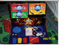
Here are two images, one without CMYK ( right )
and one with CMYK ( below right ). As you look closely between the two pictures you can see the differences in shading , lighting and color. First of CMYK is a  color profile that you can use so that photoshop provides the way color profiles are interpreted. To the left you can clearly see the whiteness of the cord and the yellow of the date imprint. If you look carefully at the second picture you can see the white has been dimmed down and the imprint of the date has changed hue. Not only the cord was dimmed down but also the rug, as if the flash  was reduced but the colors changed slightly. If you look at the color of the blue/purple plastic you can see that the plastic has become darker in hue.


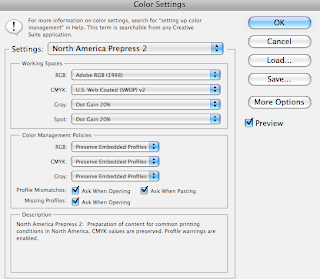
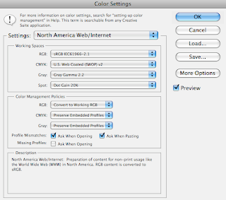
Using the Color Settings Dialog Box 
 
In this setting "North America Prepress 2"
the RGB is set to the default ADOBE RGB (1998)
The CMYK is Web Coated,Gray and Spot have a 20% Dot Gain. As for the Color Managment Policies RGB, CMYK,and GRAY and set to Preserve Embedded Profiles. Profile and Missing Profiles are checked to Ask While Opening the image.


In this setting "North America General Purpose 2" which is the default RGB is set to SRGB. CMYK is set to U.S. Web Coated and GRAY and SPOT are the same as the settings for North America Prepress 2. The color Managment Policies are the same as North American Prepress 2 ,but with the exception of the checking of Missing Profiles and Profile Mismatches.

In this setting "North America Web/Internet", the RGB mode is the same as General Purpose 2. It is set in sRGB mode,CMYK is the same as well as SPOT. The difference is the working spaces is the GRAY. The GRAY on this setting is set to Gray Gamma 2.2. Under Color Managment Policies CMYK and GRAY are set to Preserve Embedded Profiles while RGB is set to Convert to a working RGB. As for the Profile Mismatches and Missing Profiles all the boxes are checked except for Missing Profiles.


Soft Proofing


The picture to the above is a picture with CMYK.
Soft proofing is changing on-screen colors to mimic actual printing. To the bottom right is a picture with soft proofing. As you can see the colors change slightly but not really a big of a difference. The colors seem to brighten up while maintaining shadows. The picture to the bottom right is in the Kodiak 5027/7205 Printing Density (by Adobe). Also the lettering on Magic Tricks turned a bit yellow rather than white.

Tuesday, October 19, 2010

Design Principles

Emphasis is the use of making a certain point of the image apparent to the viewer. For example RED. Something that catches your eye.

Contrast is the use of putting objects or color to find differences or similarities. Complementary colors such as BLUE and ORANGE are complementary and put a sense of contrast in a image.

Proximity/Grouping is the use of putting points of an image close or far from each other to reduce the area of white space. Also to create a focal point in a image to look at or cause Emphasis.

Balance is the use of creating equal amounts of color and or texture. Such as Horizontal Symmetrical Ex   | 
, Vertically Symmetrical or Diagonally Symmetrical /

Alignment is the use of placing a object to be symmetrical or parallel to another point.

Harmony/Proportion is the use of making an image equal or symmetrical. Having equal proportion sets a example of balance.

White Space is space in an image where nothing is put.Also called White Space.

Repetition the use of repeating line to emphasize. It can also be used with color to create patterns.

Color is one of the basic fundamentals of graphic design. It adds creativity to an image.

Other Design Principles are principles in design used to make your image interesting.

The Basic Design Elements

Line: Straight or Curved
Color: Hue / Chroma
Shape
Texture:

Monday, October 18, 2010

My Color Pallet


I chose this color pallet because I felt it was a way to see the different shades of off-white.
I wanted to see and compare how the shades were alike.I liked it because it showed the different chroma's of the colors. I looked at my color pallet as not really bland but interesting. Also as i stared at the middle color it seems to blend in with the color on the right and disappear. I also liked the fact that the color farthest left stood out the most.

Monday, October 11, 2010

Collage Project Reflection

In Visual Design we were assigned a project to create a collage.The projects objective was to get myself familiar with photography and to become familiar with the tools Photoshop CS5 has to offer. The first challenge I had was to choose pictures for my collage.Considering my overall outline of who I am,the first thing that popped to my mind was fencing. Fencing is now a part of my life due to practice , competitions, tournaments and etc.Then I chose pictures such as things in my house, my everyday life, and what I see everyday.As I went along with my collage different ideas and pictures came to mind. I then proceeded to add these ideas into my collage.

I was satisfied with my result. Since I was brainstorming as I went along the project came out to be completely different from what I was thinking of. Though the overall idea of a collage in shape of fencing stuck. As I was doing this project the challenges I faced were relearning how to  make a mask in CS5. Since I had completely forgot and CS5 brought a new interface,I then used the help of the internet. After finishing my project I really couldn't find anything else to add to it. I was content with the outcome as I took a minute to really take in all of the aspects of the collage.There is probably a lot of things CS5 has to offer to make it better that I have no knowledge of , but hey that's the point of learning.